FEATURED PROJECTS

NAUMA
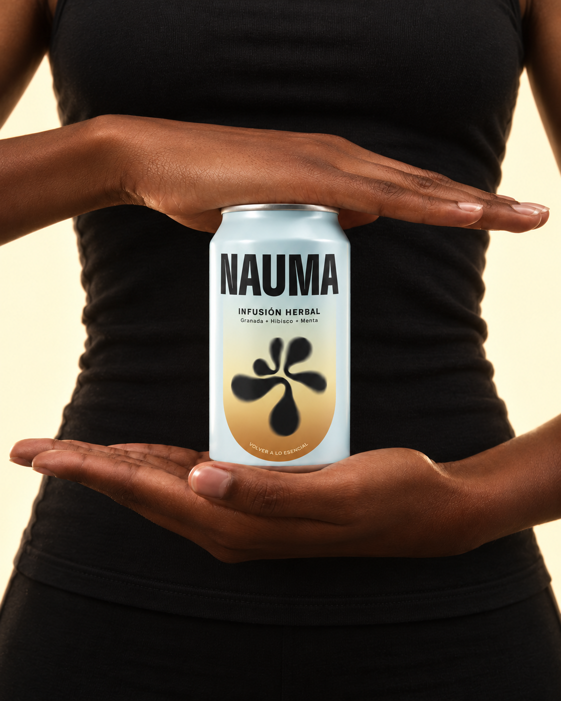
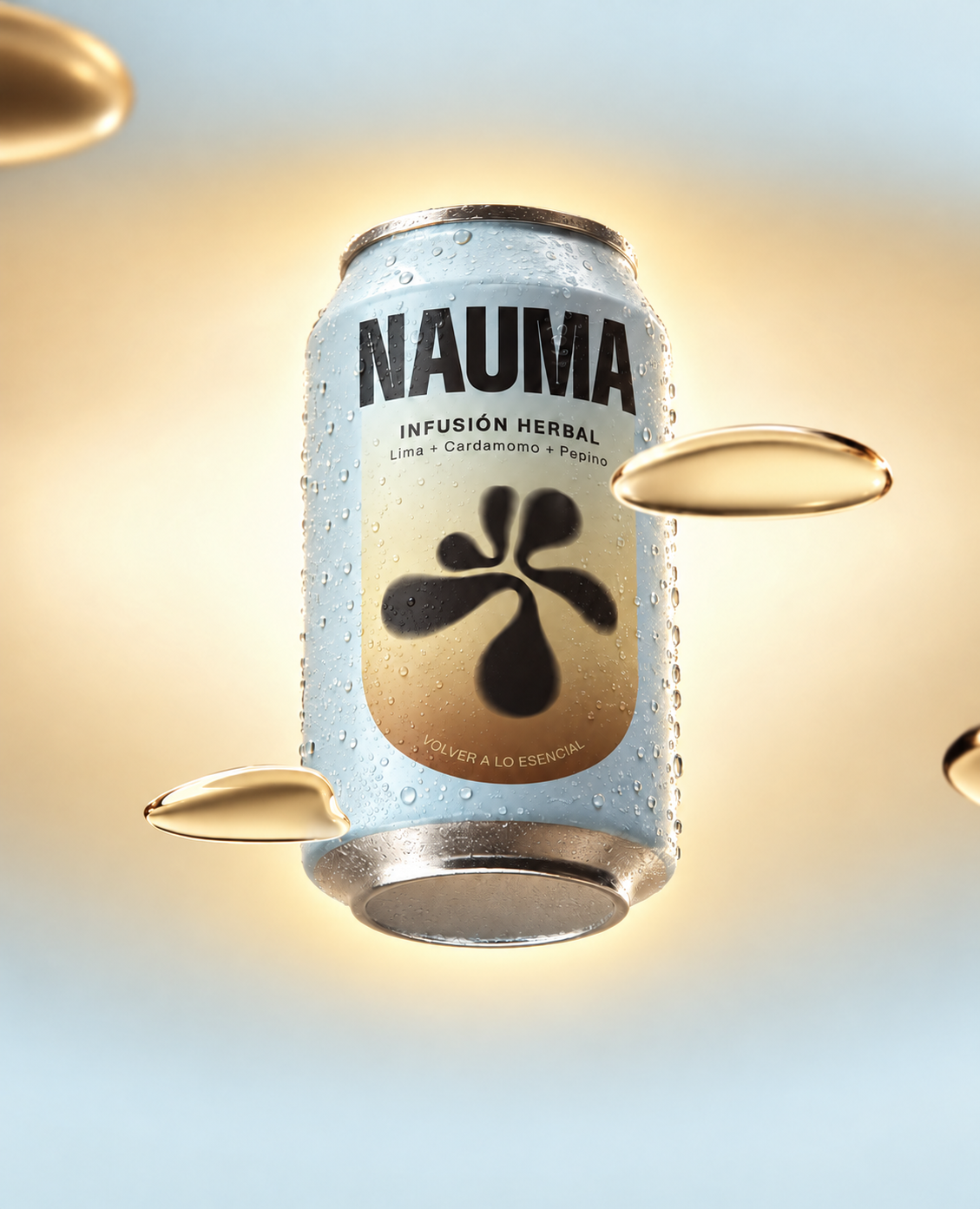
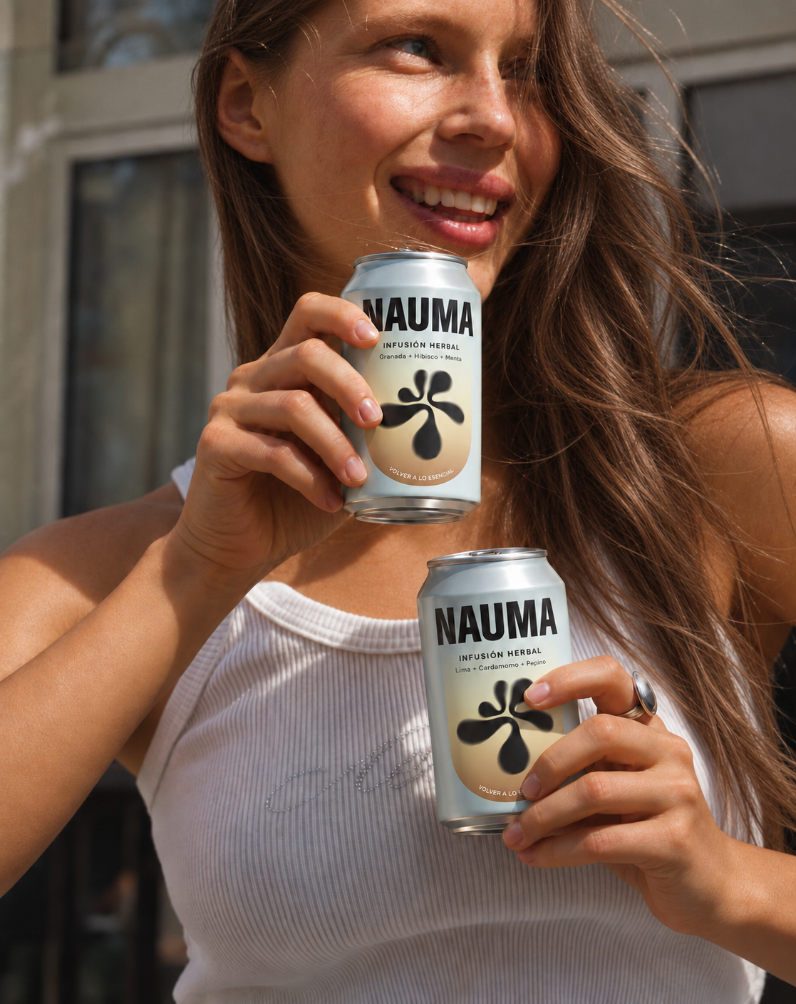
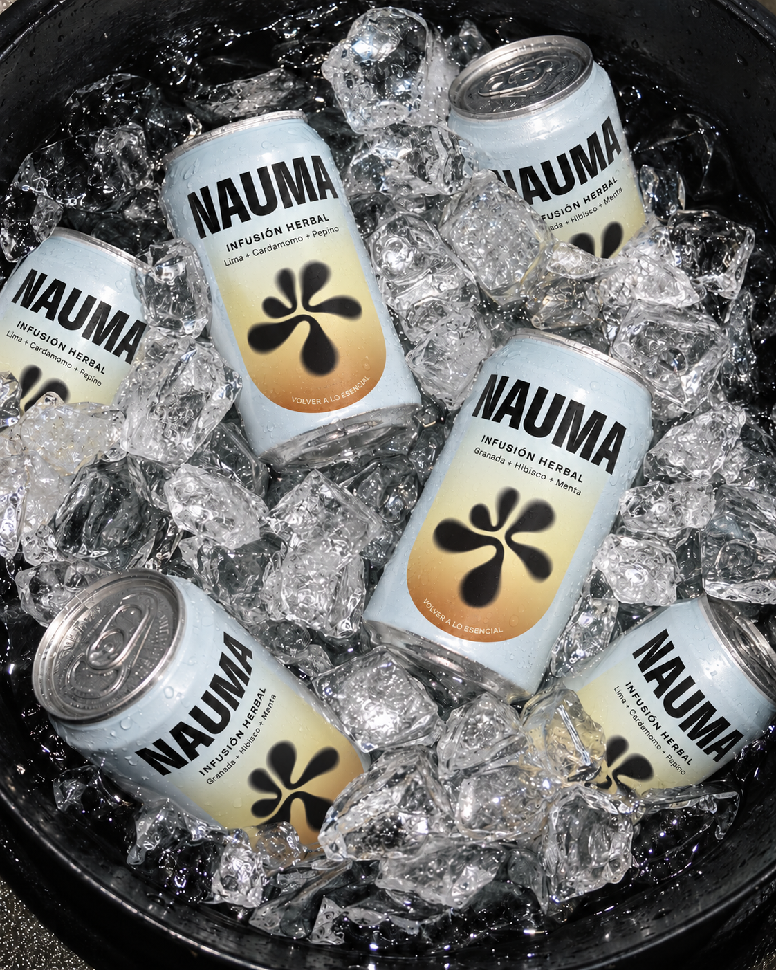
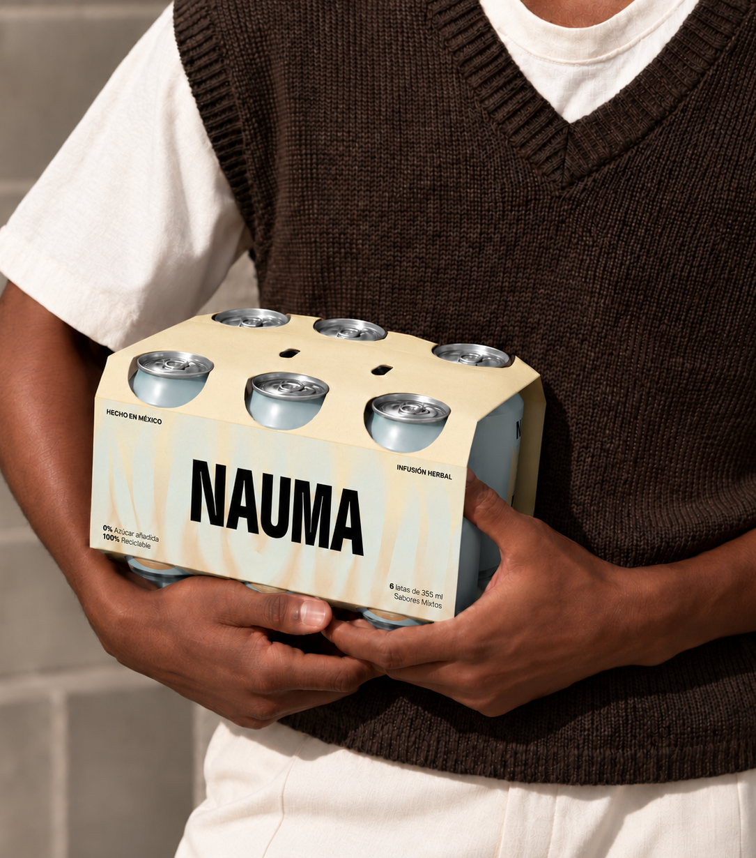
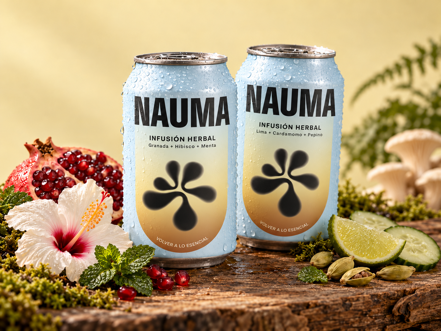
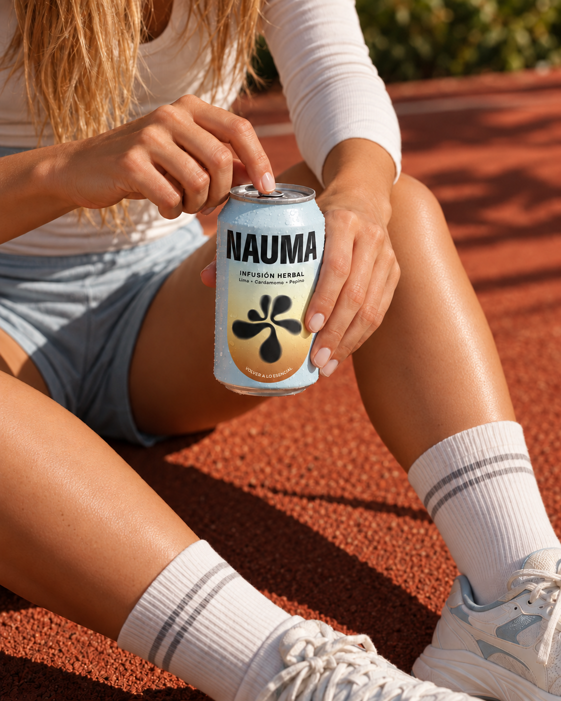
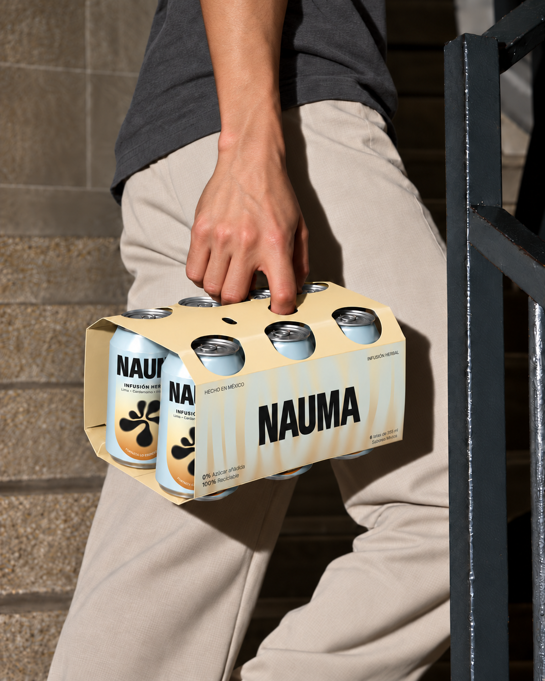
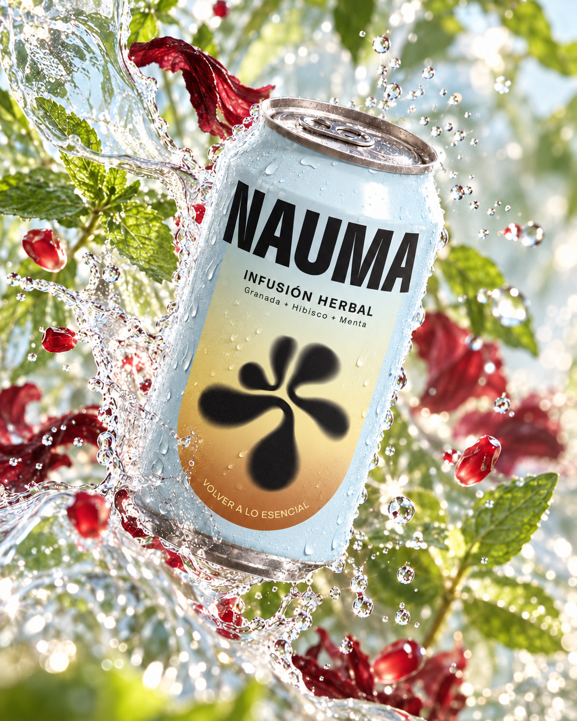
A herbal infusion brand inspired by Ihíyotl, one of the three animating forces of the human being in the Nahua worldview. Associated with life, internal movement, and the energy that animates us, this concept became the starting point for a brand that sees everyday care as a source of transformation.
THE CHALLENGETo translate an abstract concept of vital energy into a clear, approachable brand. I wanted Nauma to express a gentle approach to well-being. One rooted in small rituals, a connection to nature, and respect for the body’s own rhythms.
DESIGN APPROACH“Transformation begins within.” became the guiding idea behind the branding. I explored how inner vitality could inspire a contemporary narrative of calm, gradual change. The ritual of preparing an infusion gave this idea a tangible expression: a simple moment to pause, nourish, and reconnect with ourselves.
BRAND EXPRESSIONThe intention is to make the experience feel thoughtful and personal, carrying its central belief into everyday life: meaningful change begins with the small things we do for ourselves.
DYNAMIC HEALING
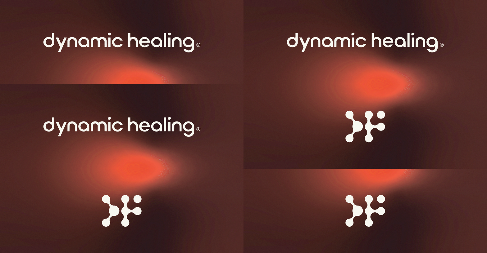
A clinical medicine brand focused on personalized care for children and individuals with autism spectrum disorder. Through advanced evaluation, diagnostics, and customized treatment protocols. I developed the identity around the connection between scientific expertise and compassionate care, giving the practice a contemporary, human presence.
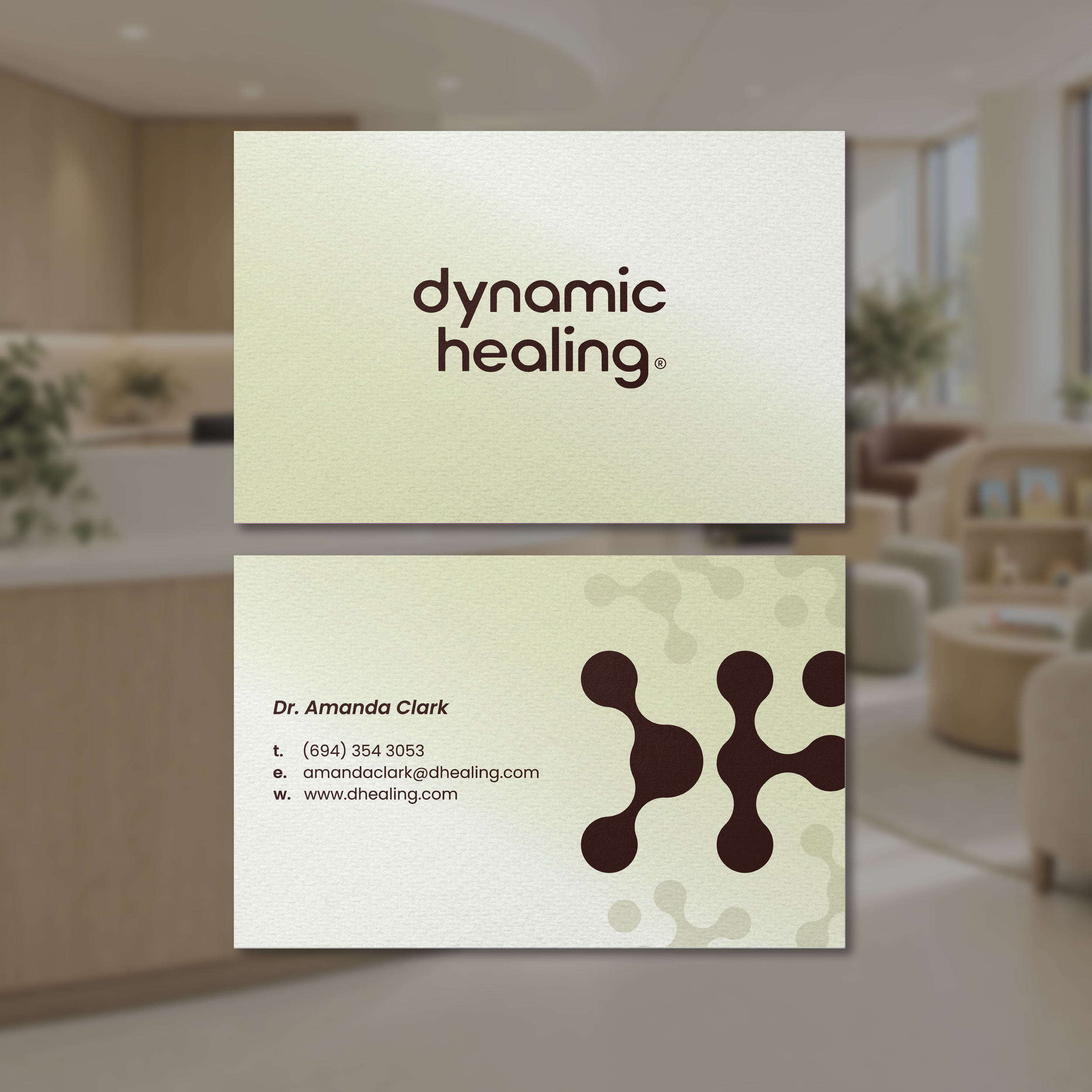
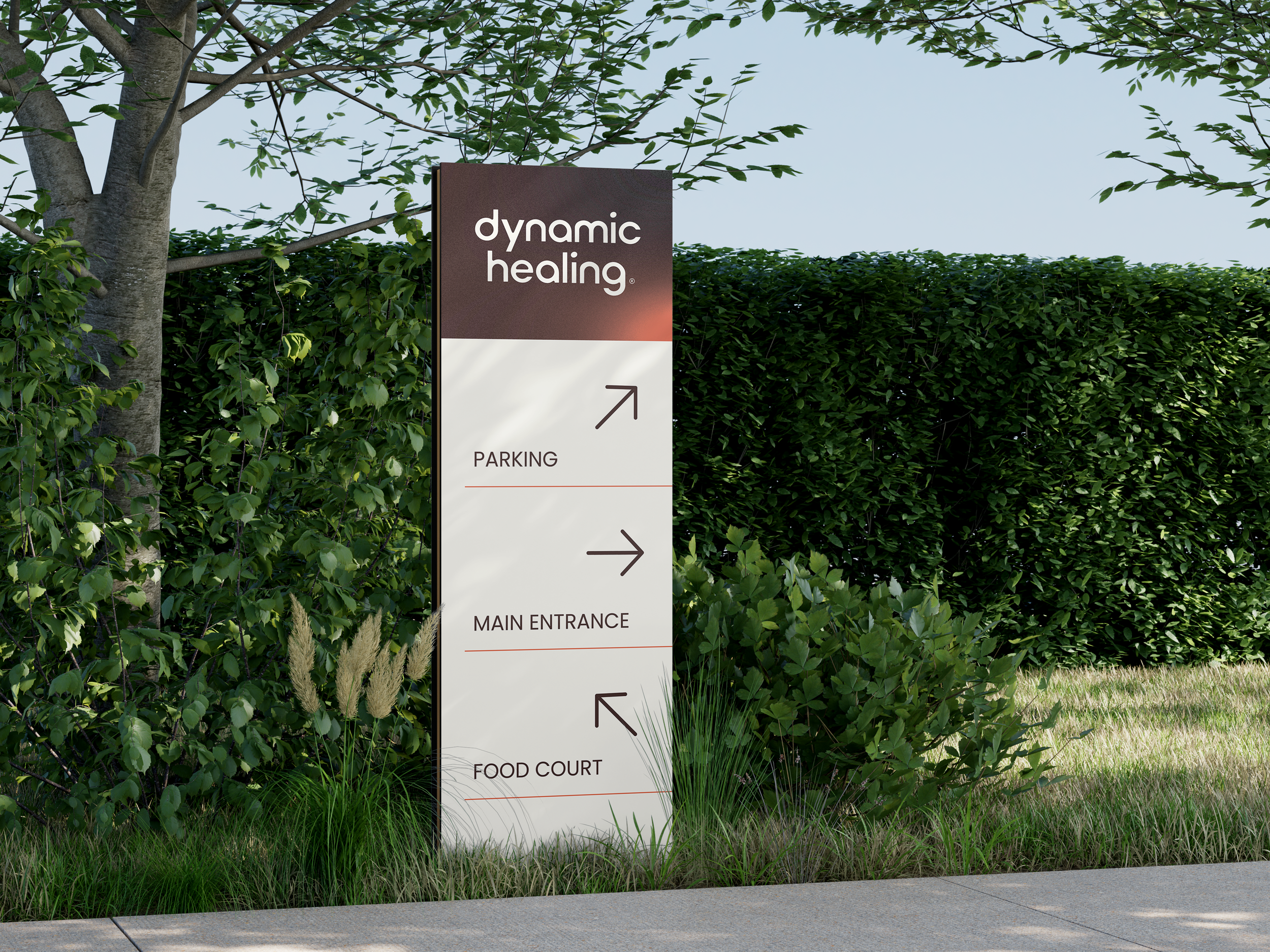
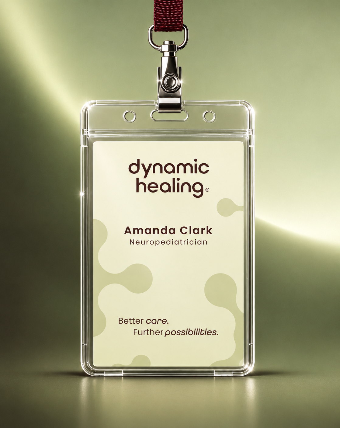
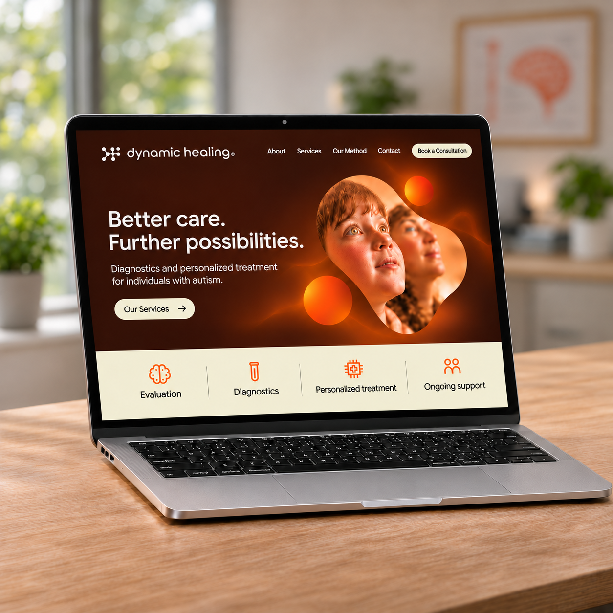
THE CHALLENGETo communicate medical precision while creating a welcoming identity for patients and families. The system needed to feel professional and distinctive, with the flexibility to work across digital communications, printed materials, staff identification, and the clinical environment.
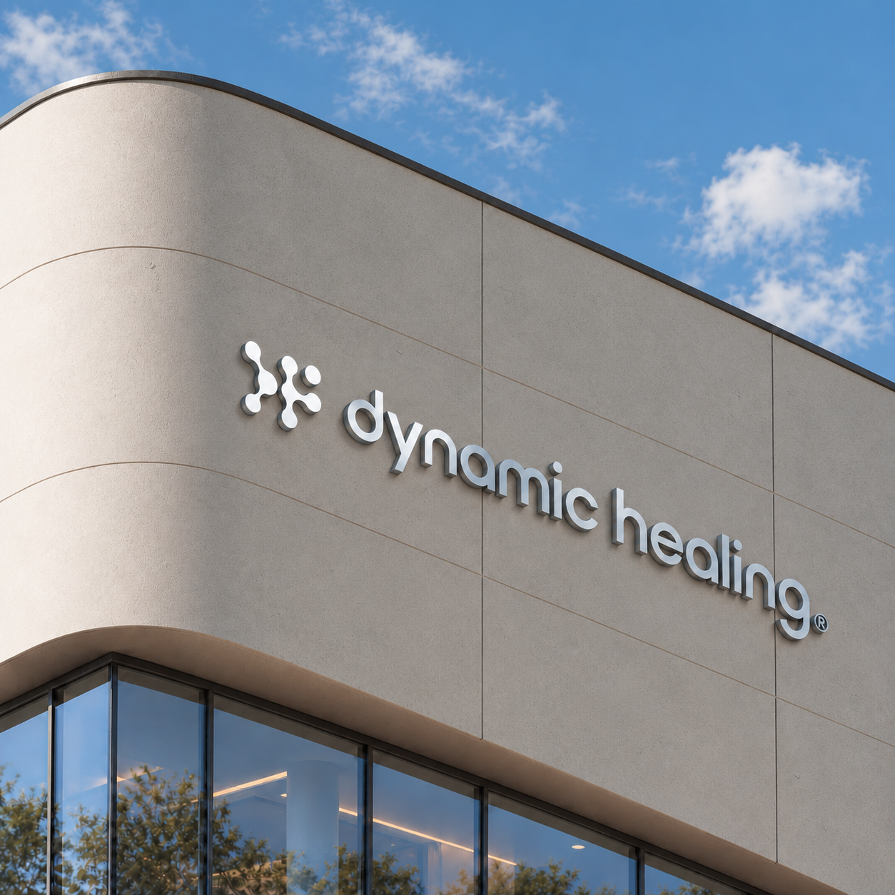
DESIGN APPROACH“Better care. Further possibilities.” became the guiding idea behind the identity. I used connected, rounded forms to reflect a dynamic approach to care, extending them into patterns and image frames that give the system flexibility. The logo adds an approachable quality, balancing the symbol’s scientific character. Deep brown grounds the palette, pale yellow-green brings softness, and orange adds energy and emphasis. Together, these choices give Dynamic Healing a distinctive presence in healthcare while expressing the warmth and expertise behind its personalized approach.
BRAND EXPRESSIONAcross every touchpoint, I wanted Dynamic Healing to make patients and families feel considered, guided, and welcomed. From the warmth of the visual language, the identity expresses a belief at the heart of the practice: care should adapt to the person, because every patient’s path is different.

THE AMERICAN SCHOOL FOUNDATION OF MONTERREY
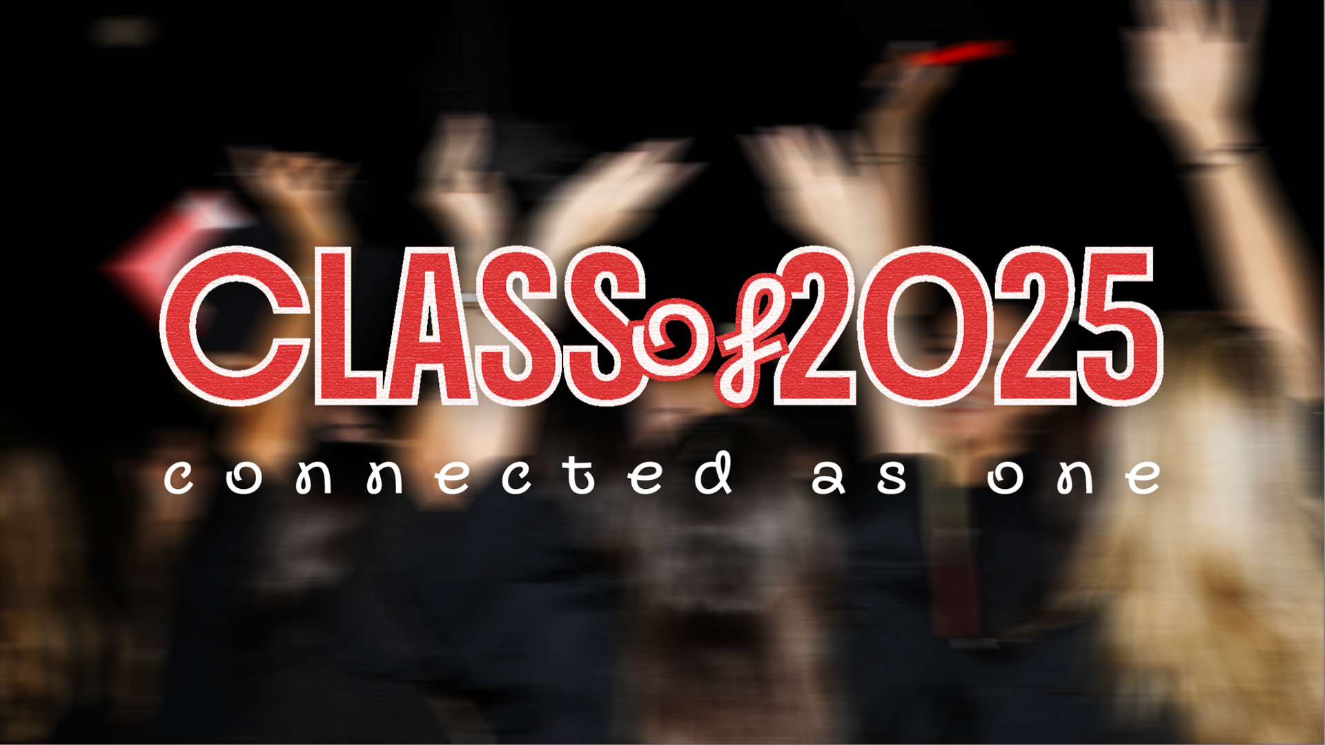

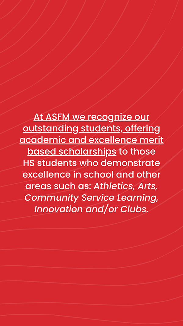
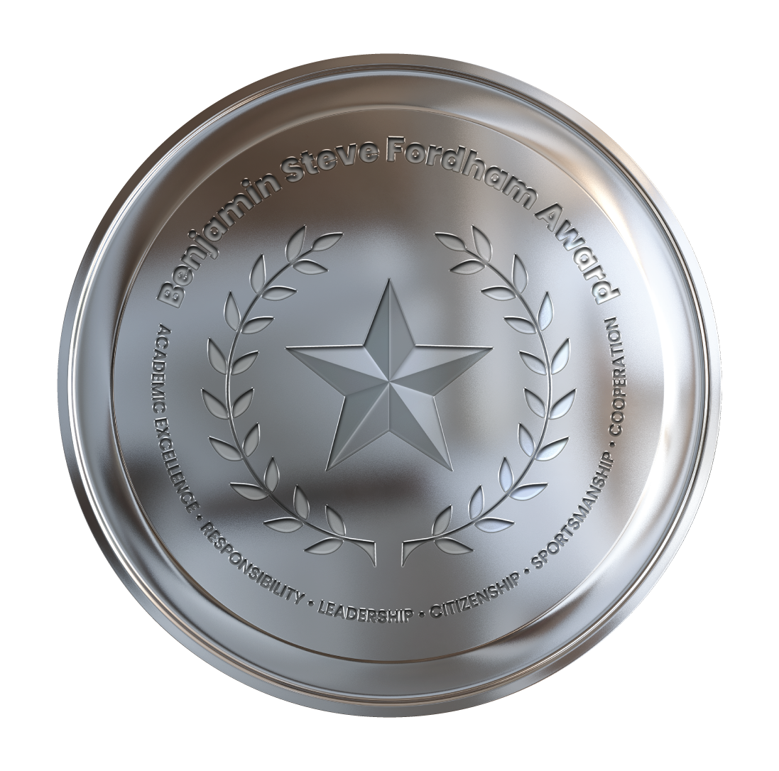
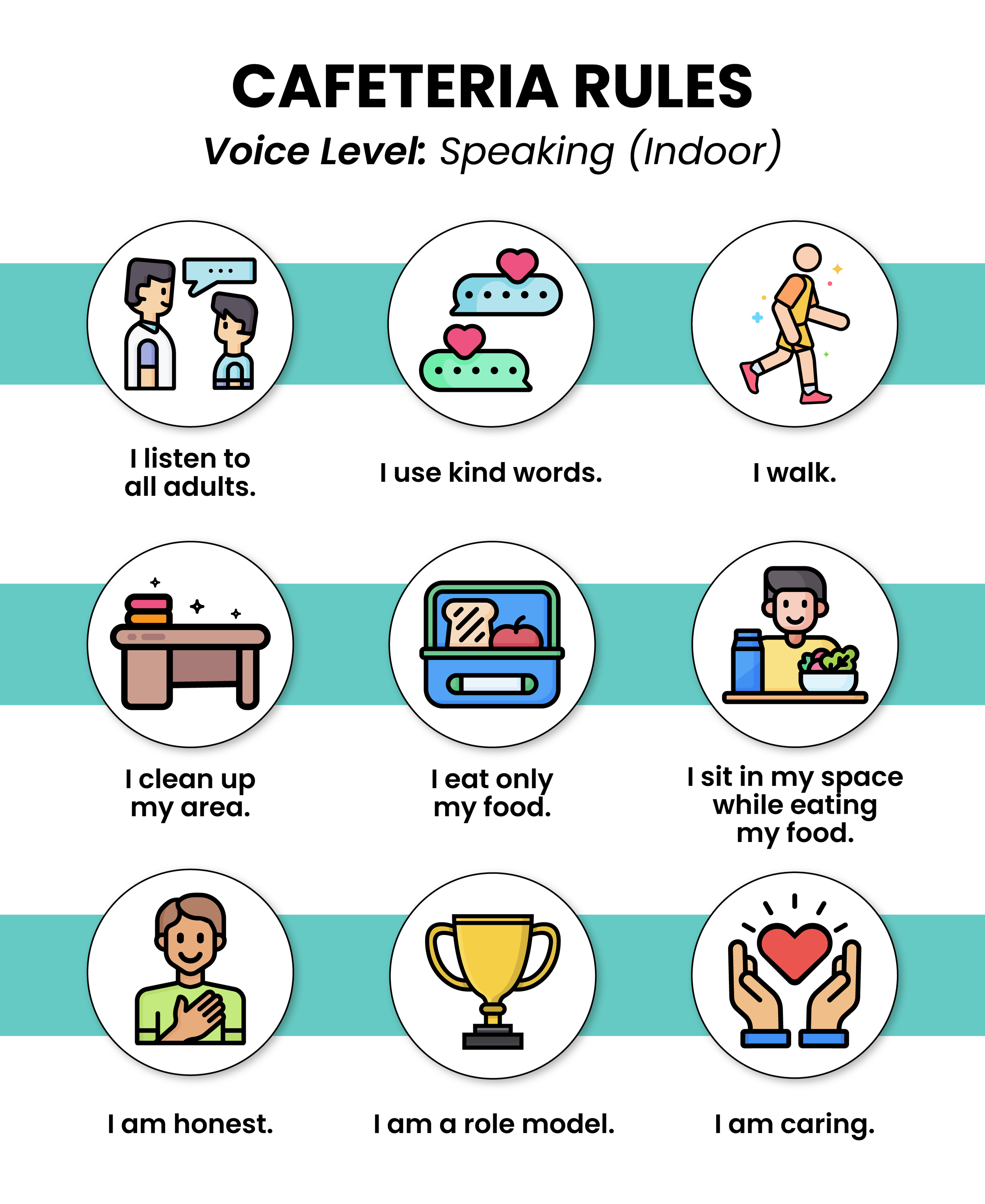

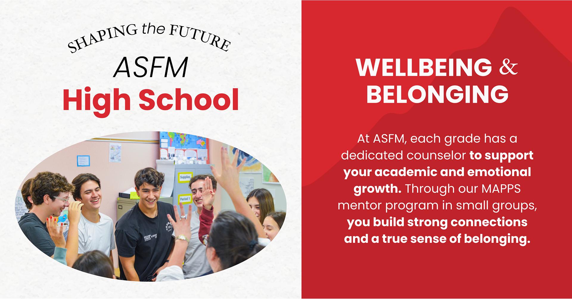
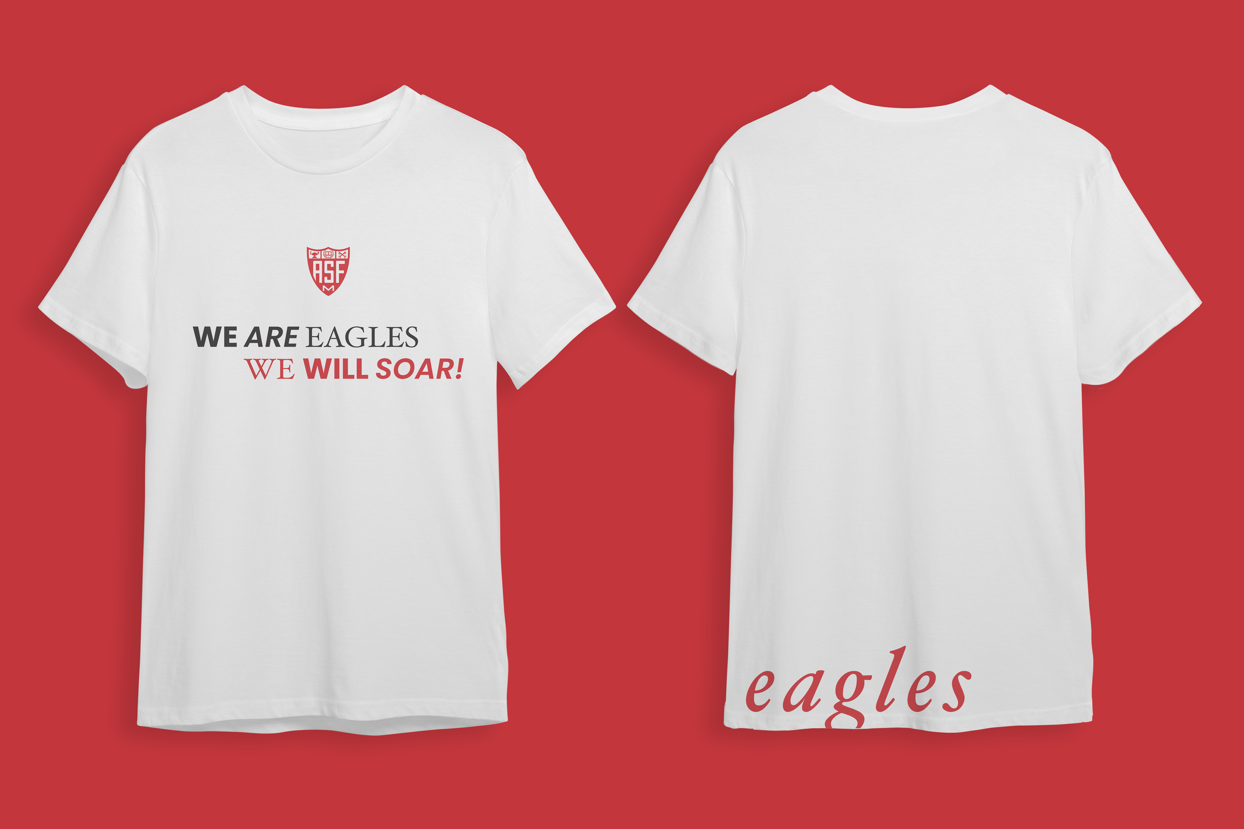
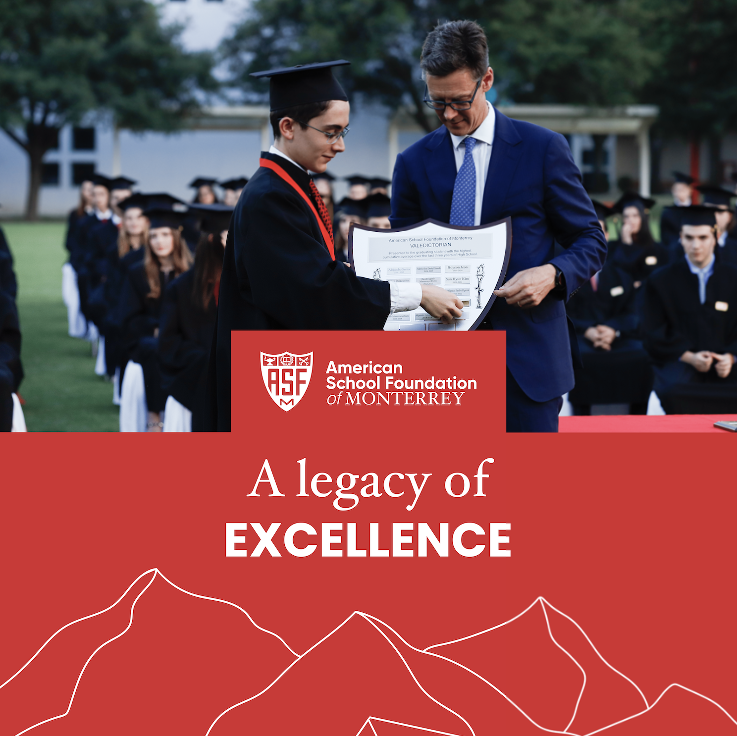
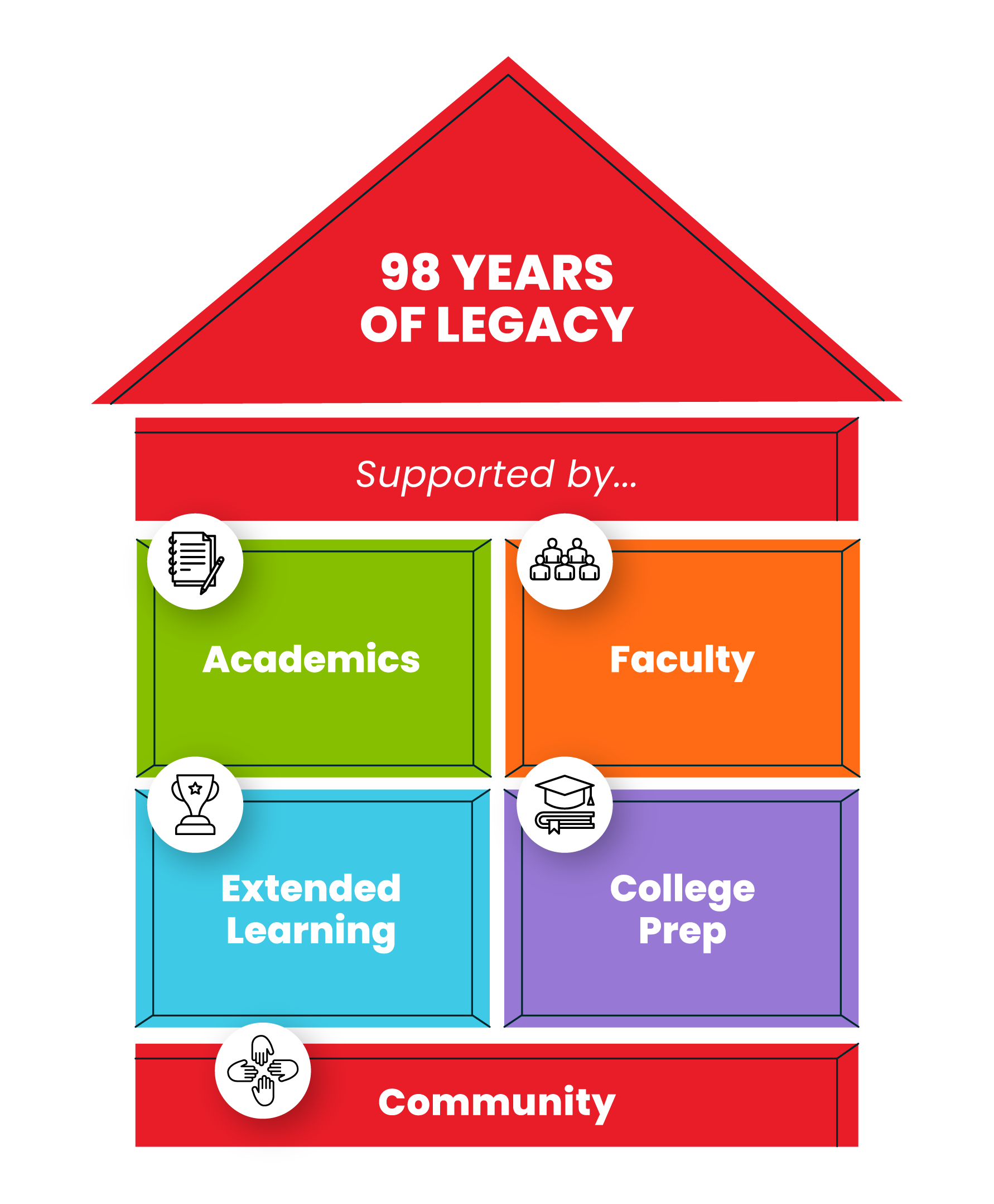
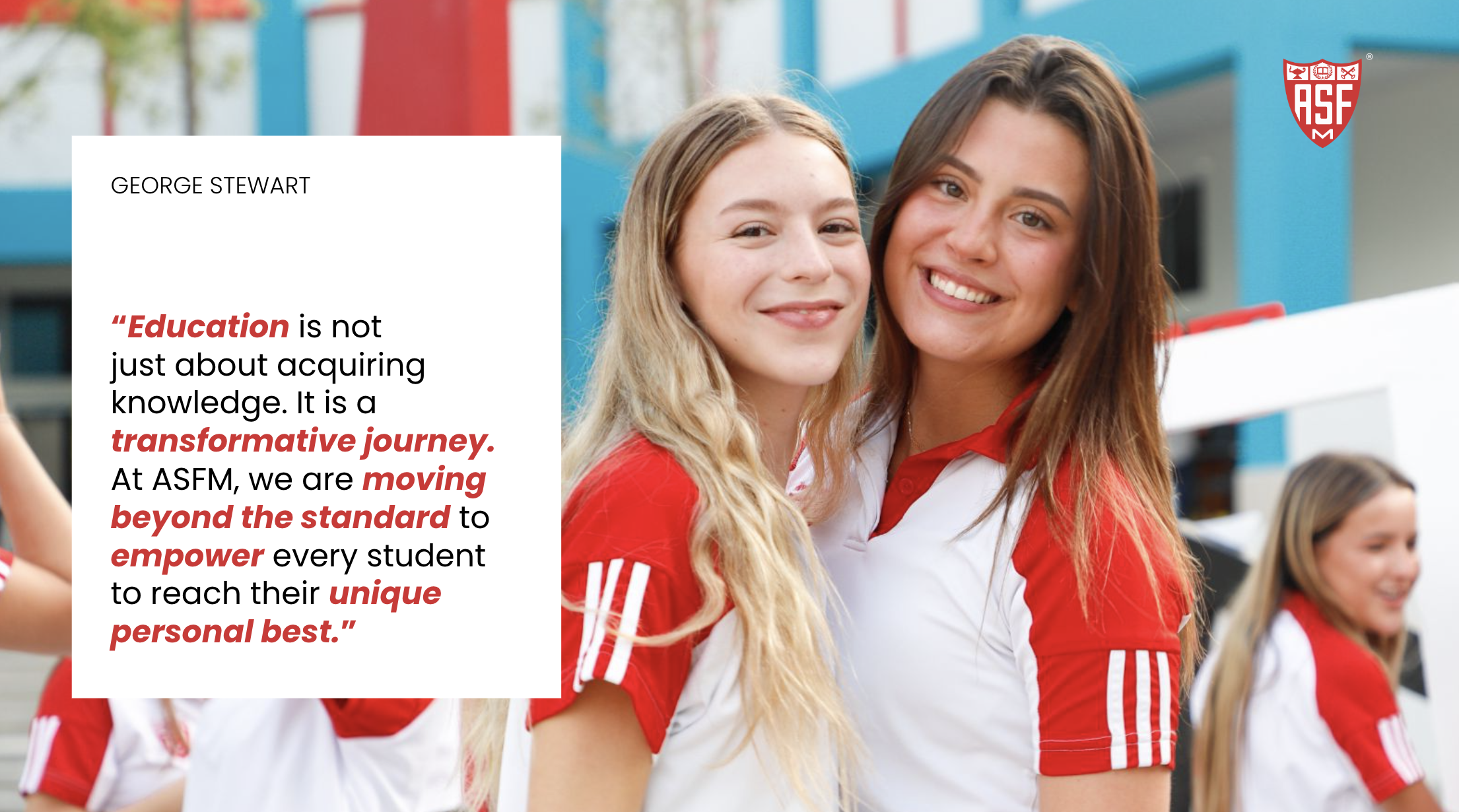
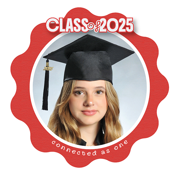
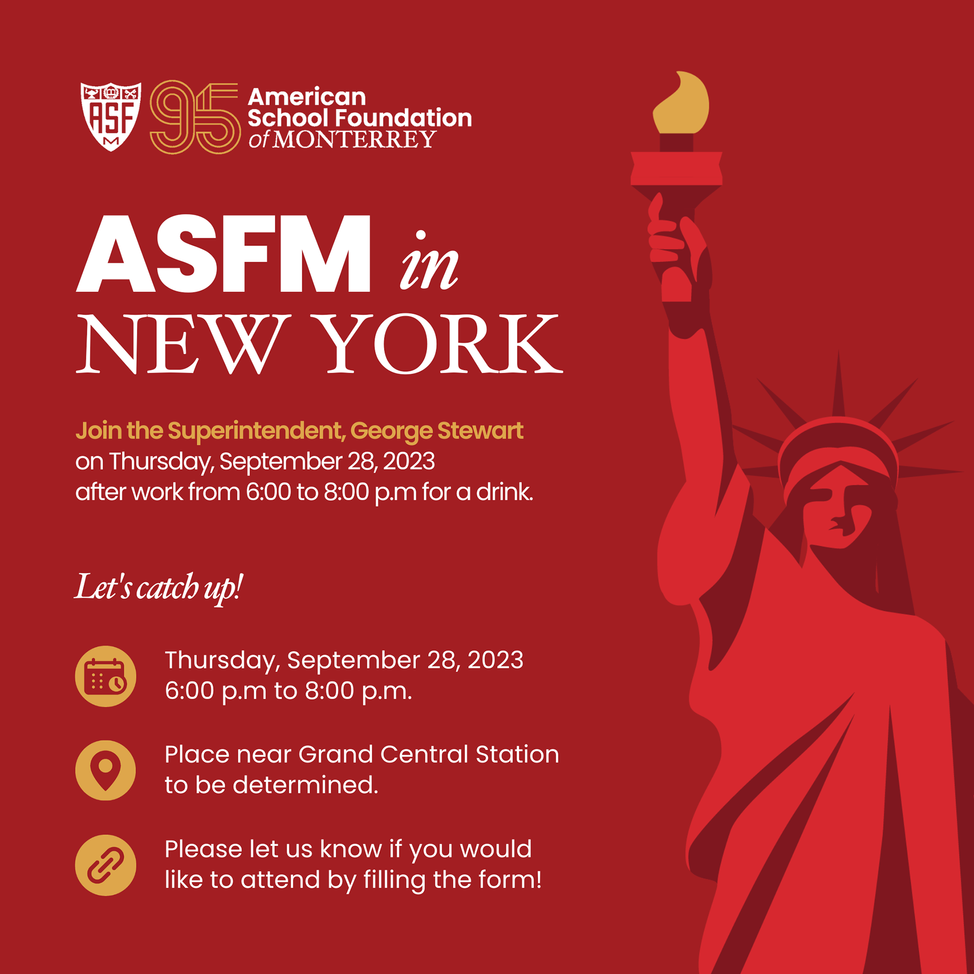
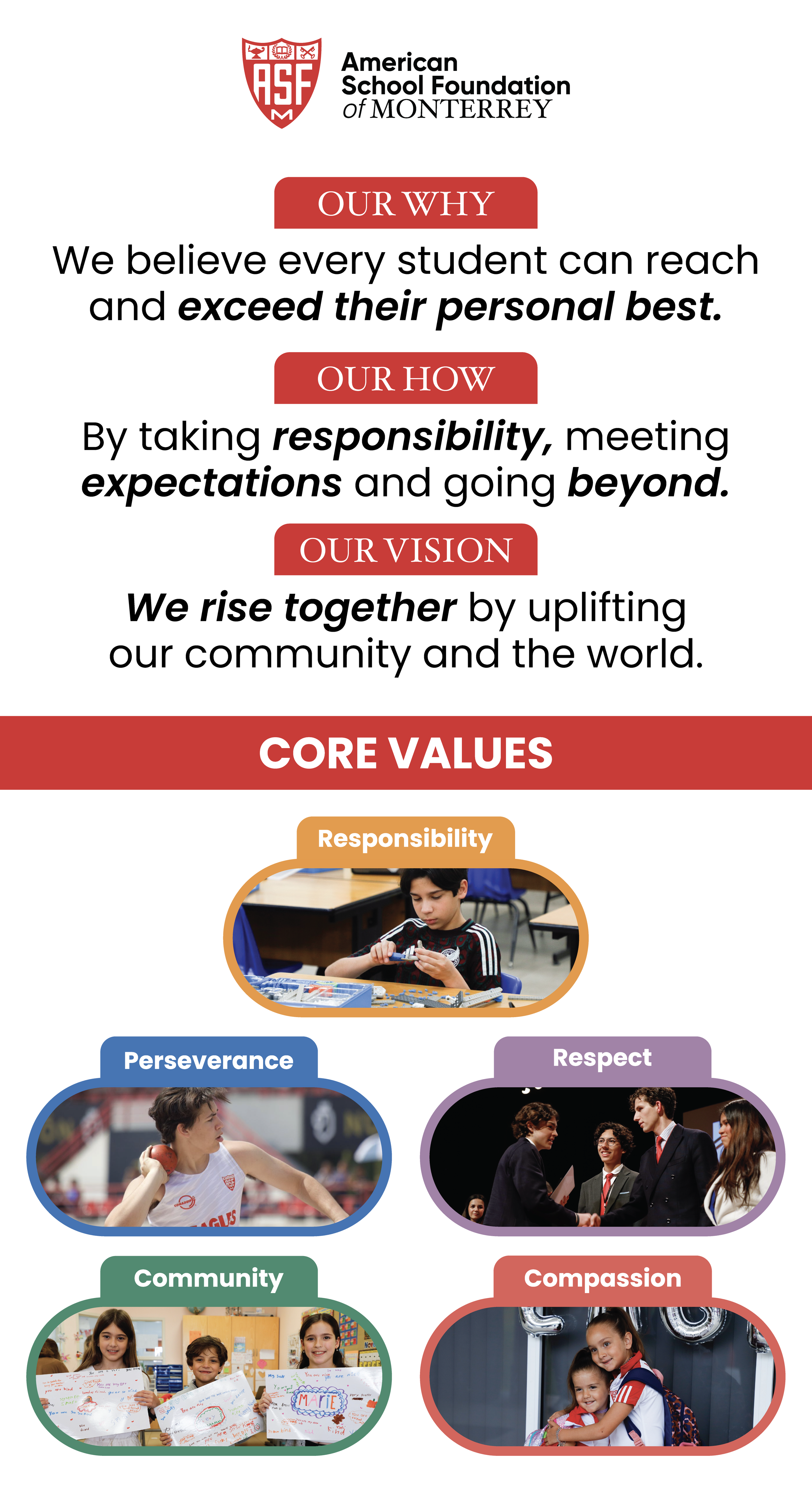
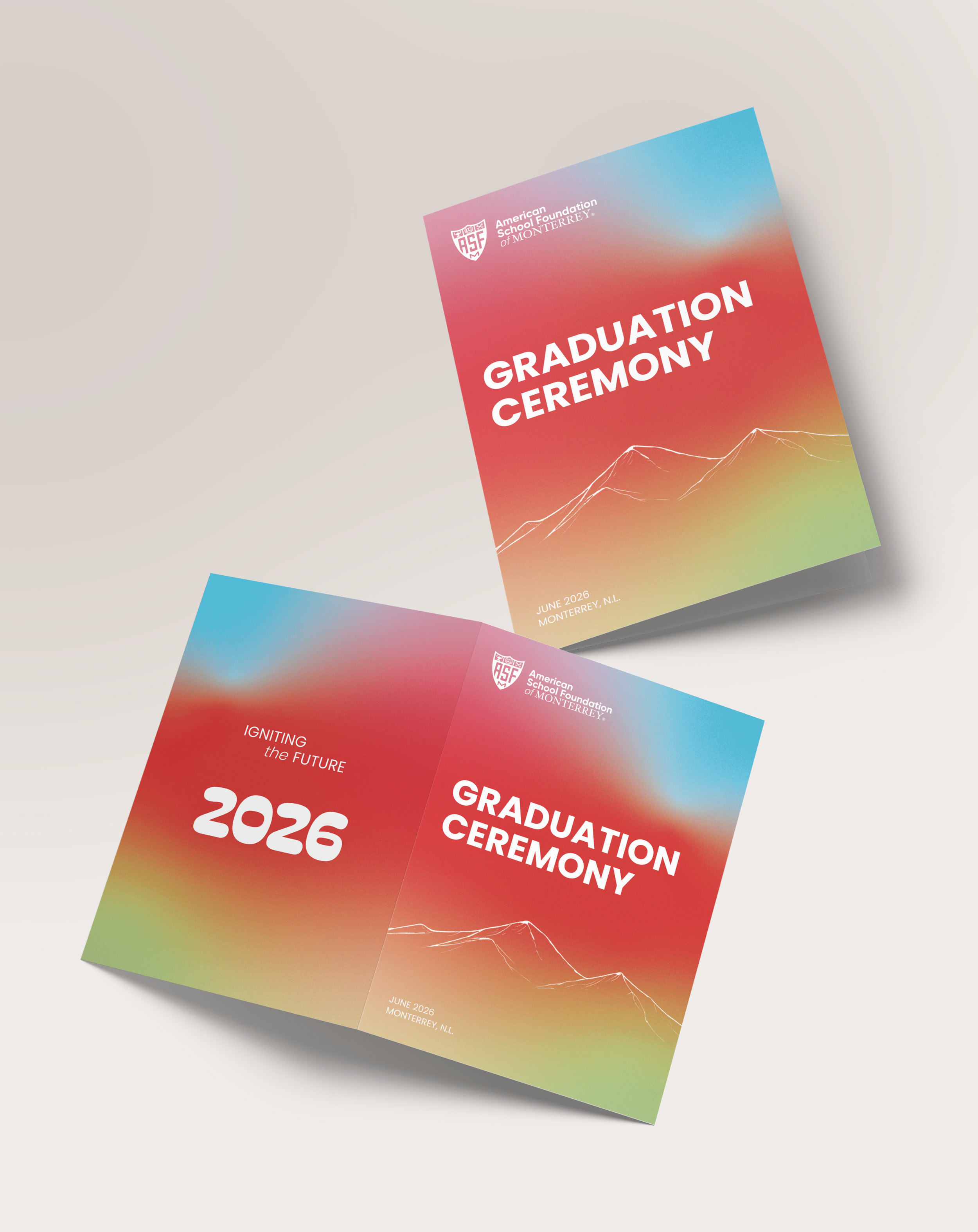
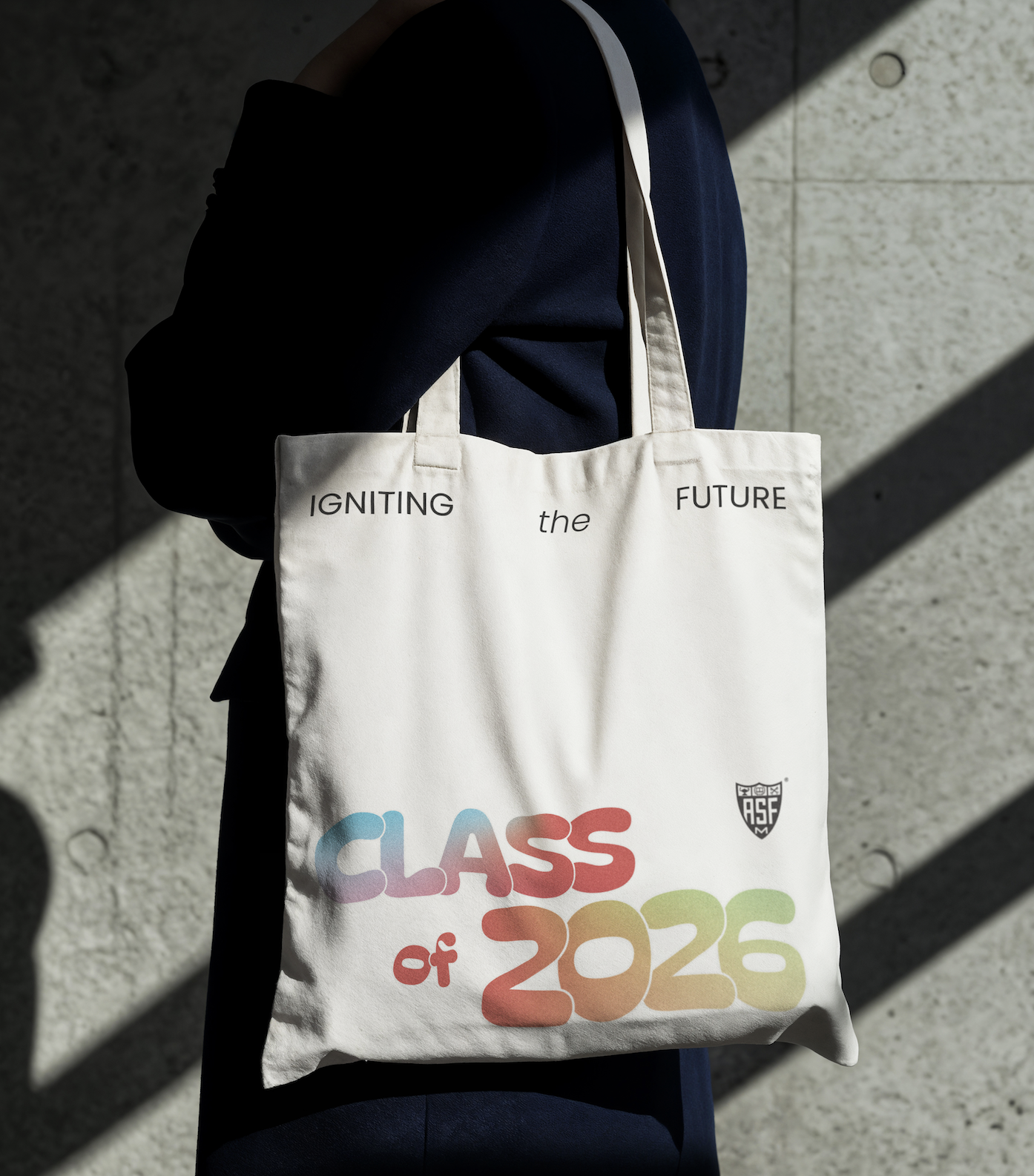
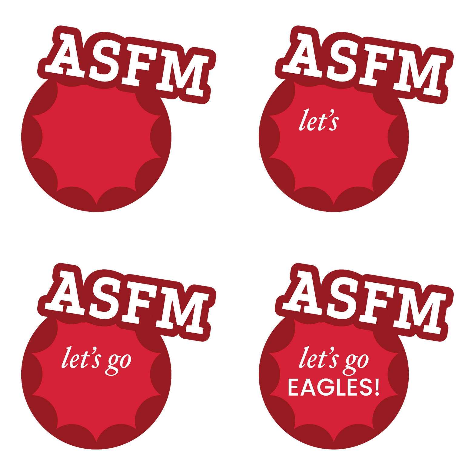
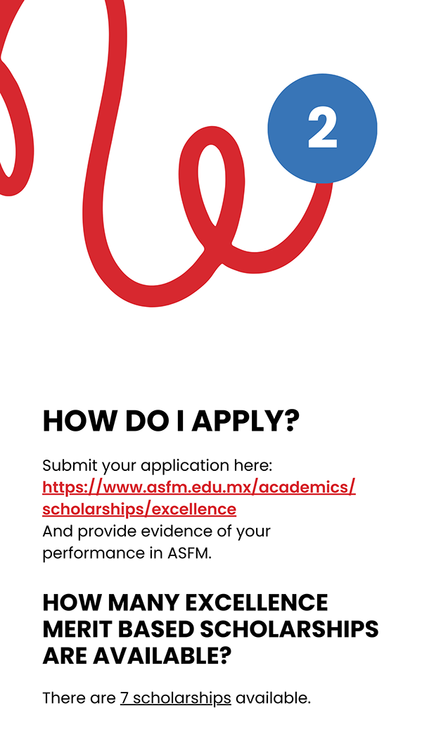
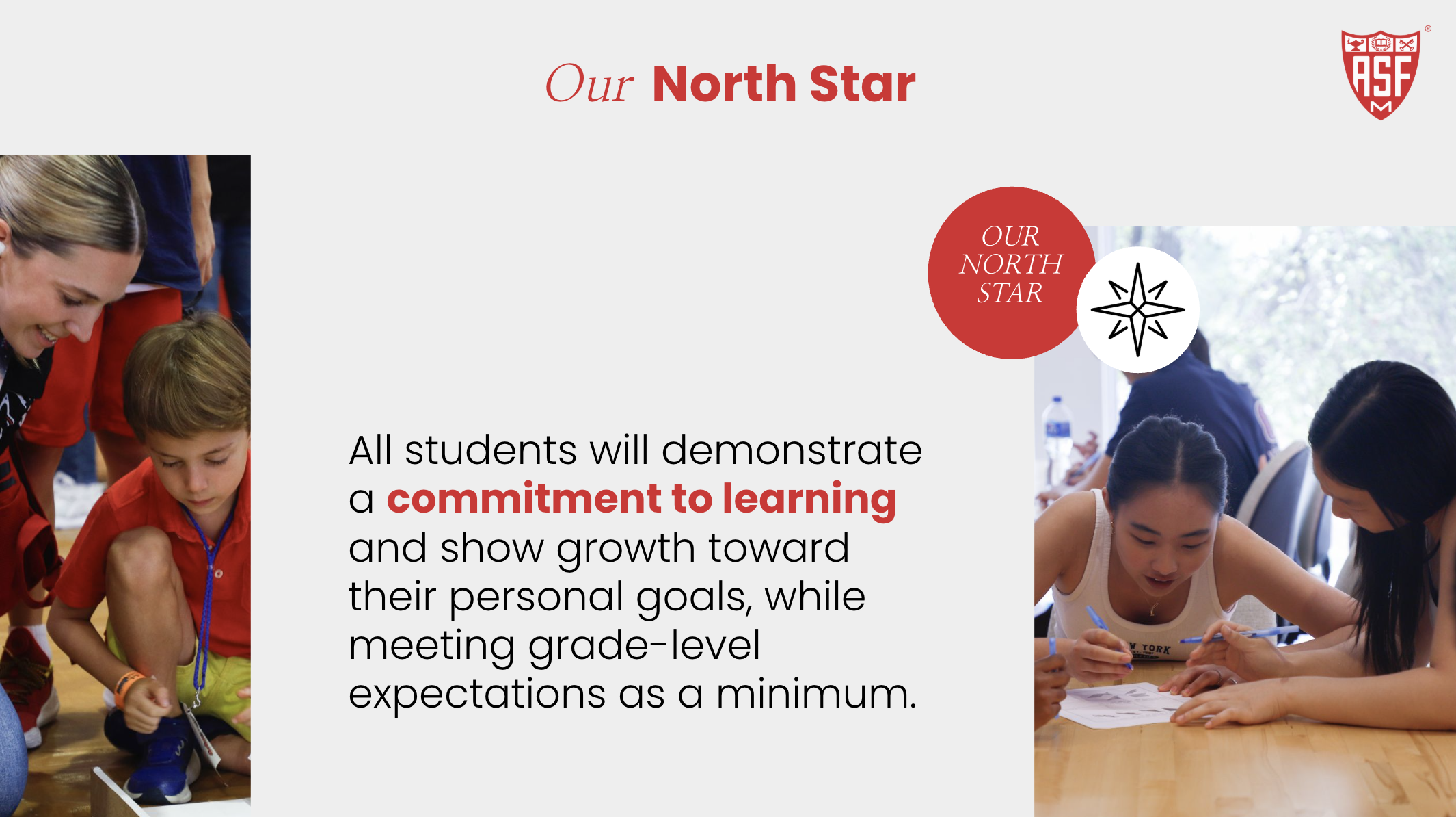
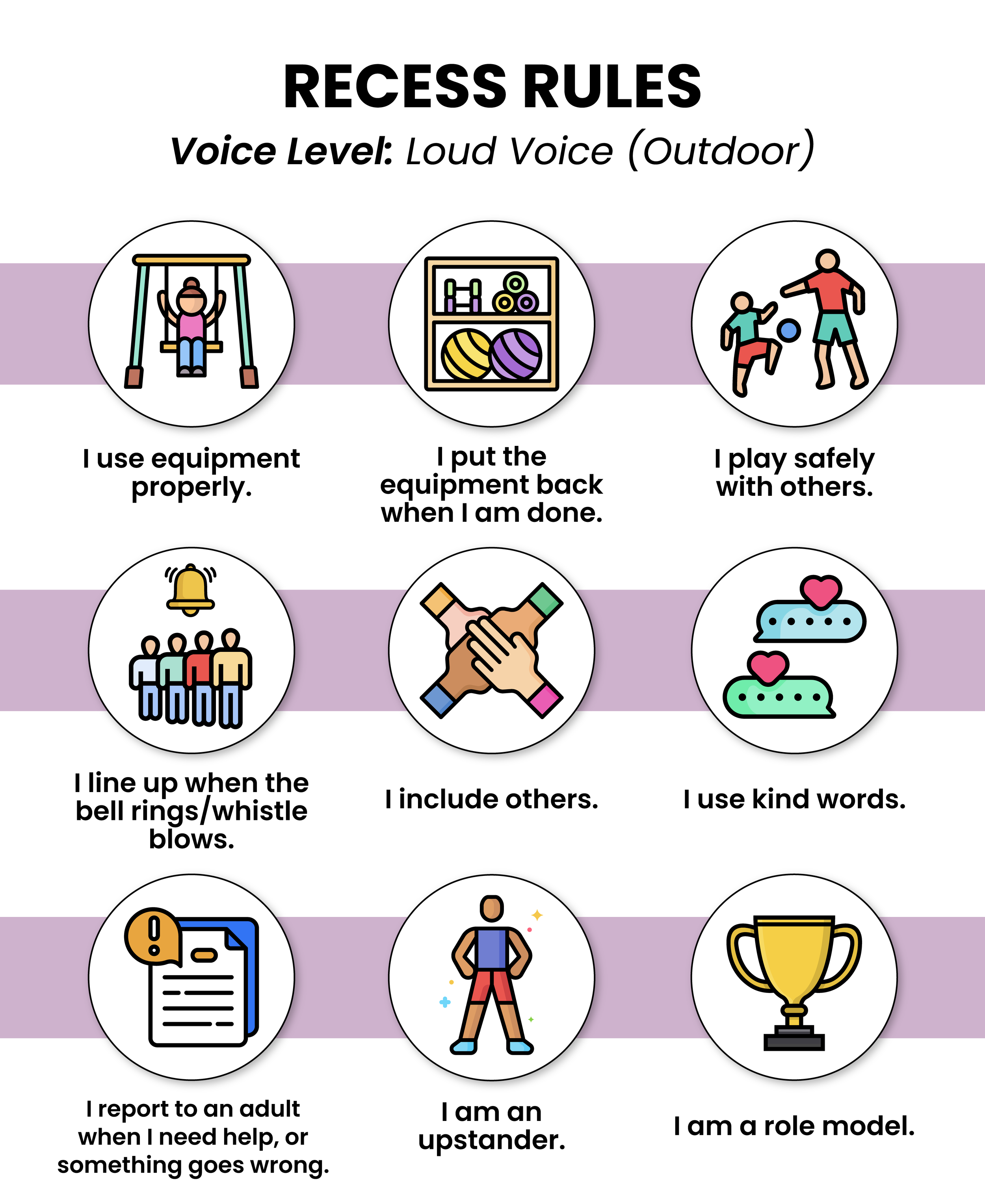
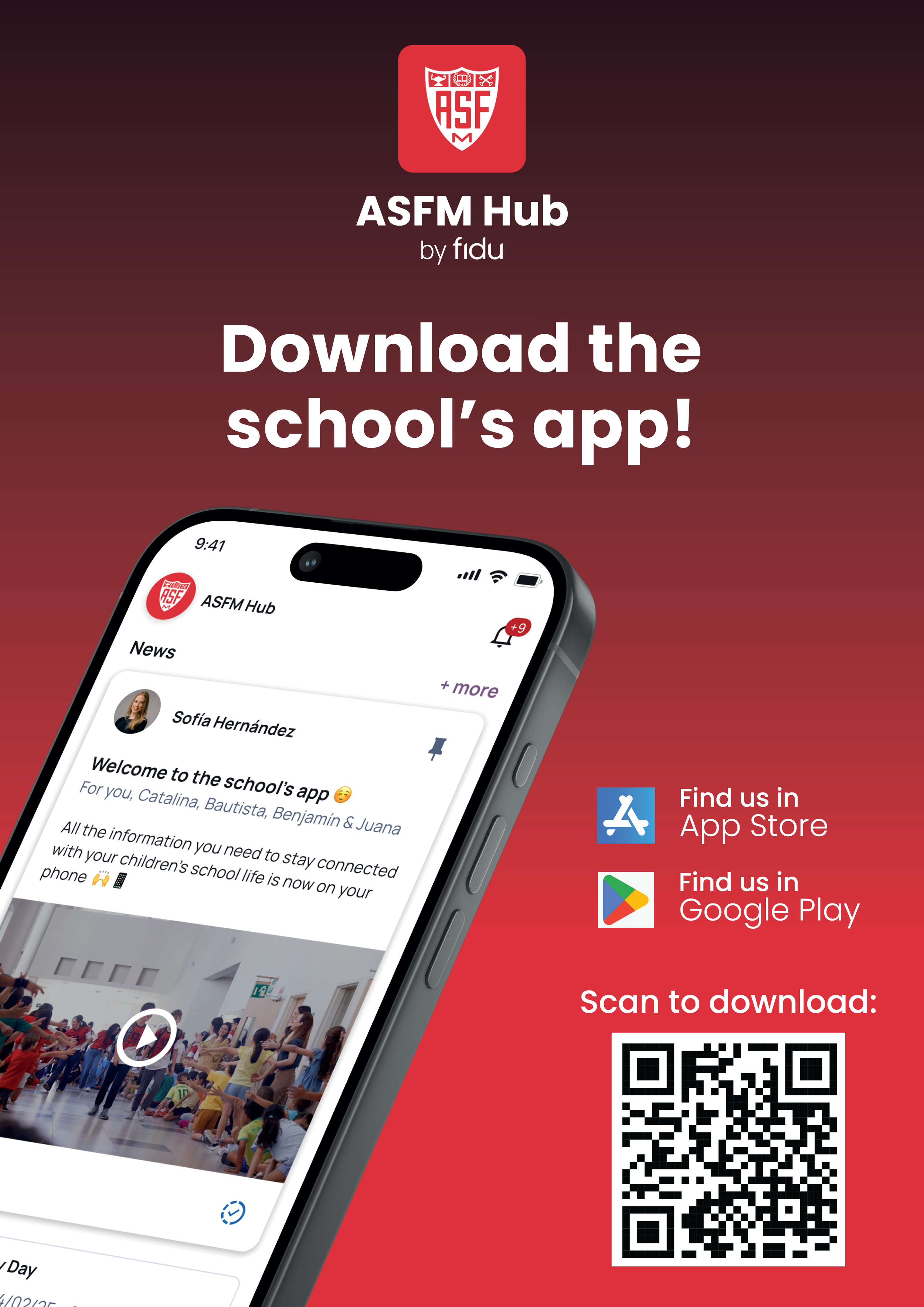
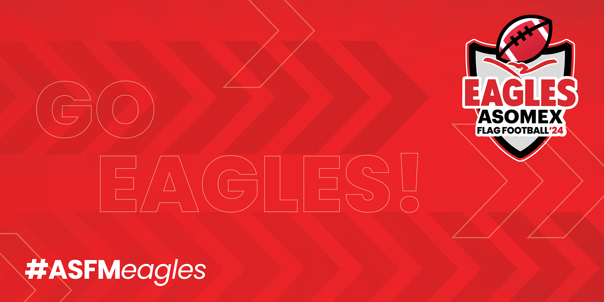
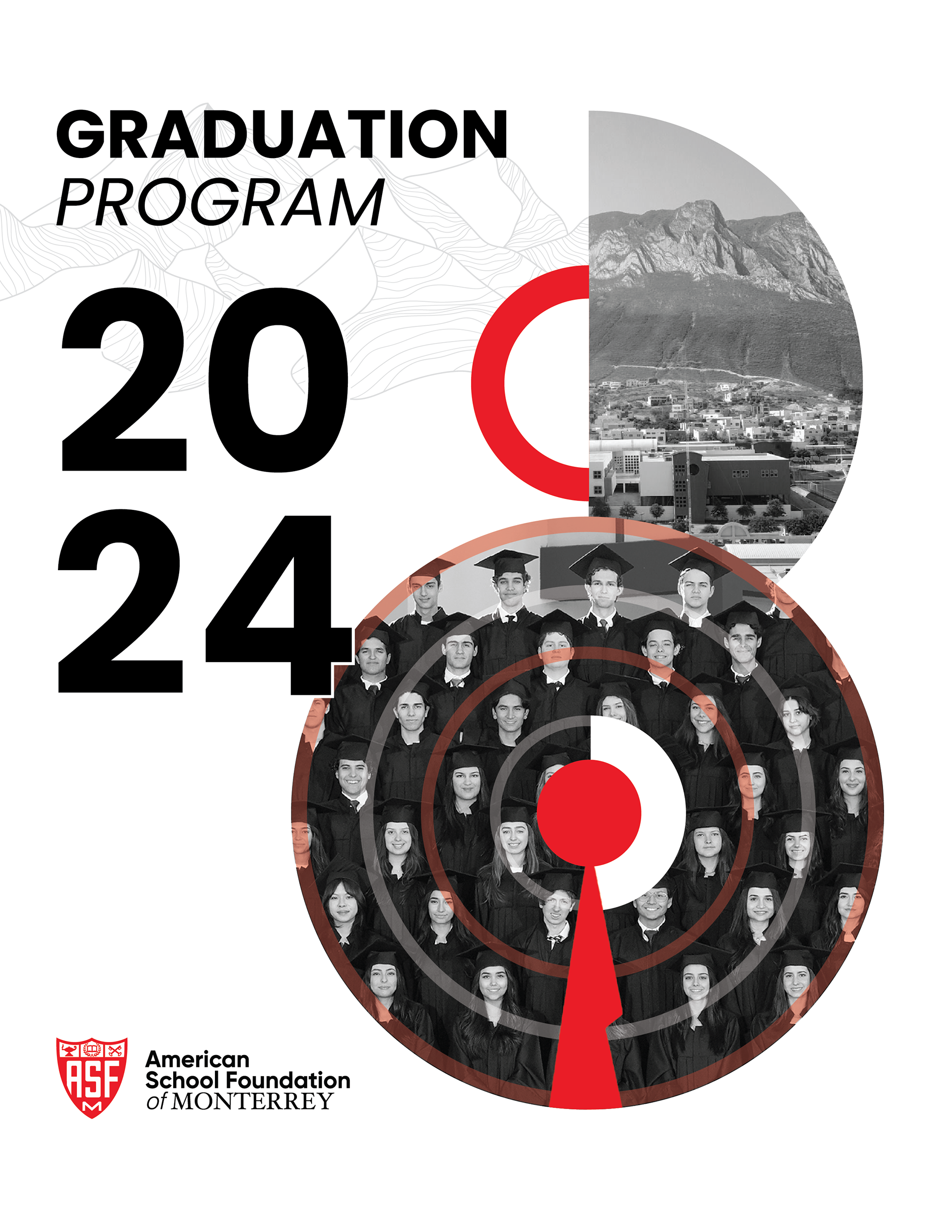
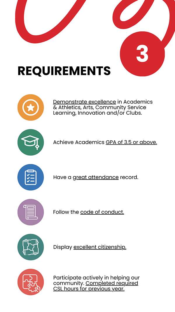
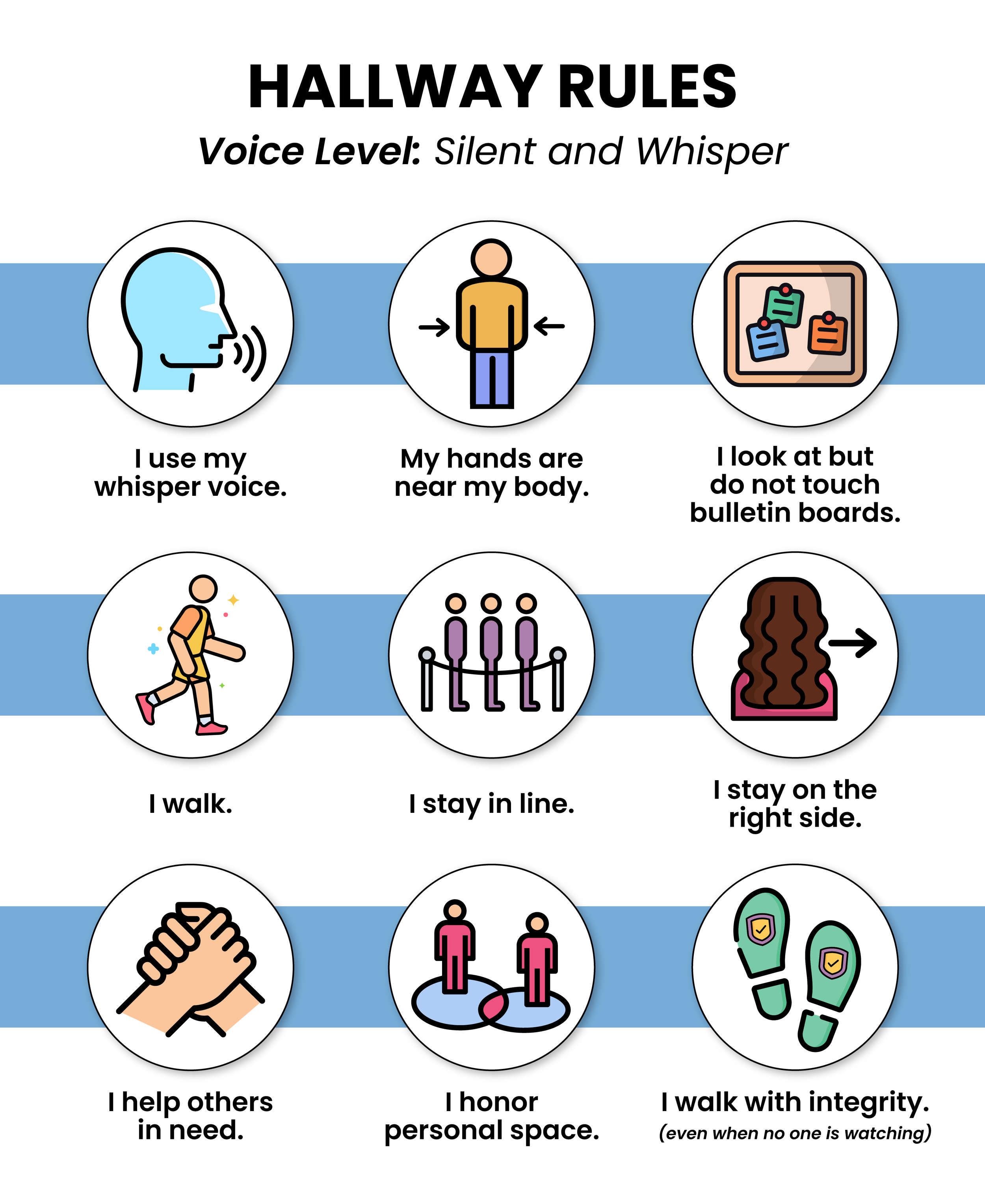
Institutional Branding & CommunicationsAs a Graphic Designer & Content Creator at ASFM, I worked on renewing the school’s visual identity and bringing it into everyday communications. My work spanned advertising campaigns, social media, website graphics, and materials supporting internal and external initiatives.
Beyond design, I developed communication plans and managed an external design and marketing agency to support institutional projects. This involved balancing creative direction with the practical needs of a school community, keeping communications clear, cohesive, and recognizable.
The selected work showcases how I translated ASFM’s identity across different formats and touch points, creating a consistent visual language while giving each initiative its own expression.



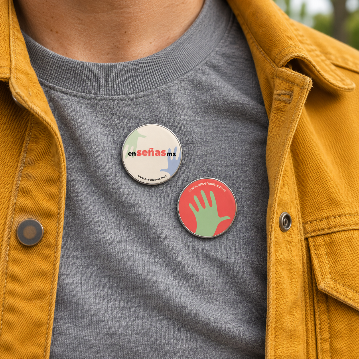
ENSEÑAS MX
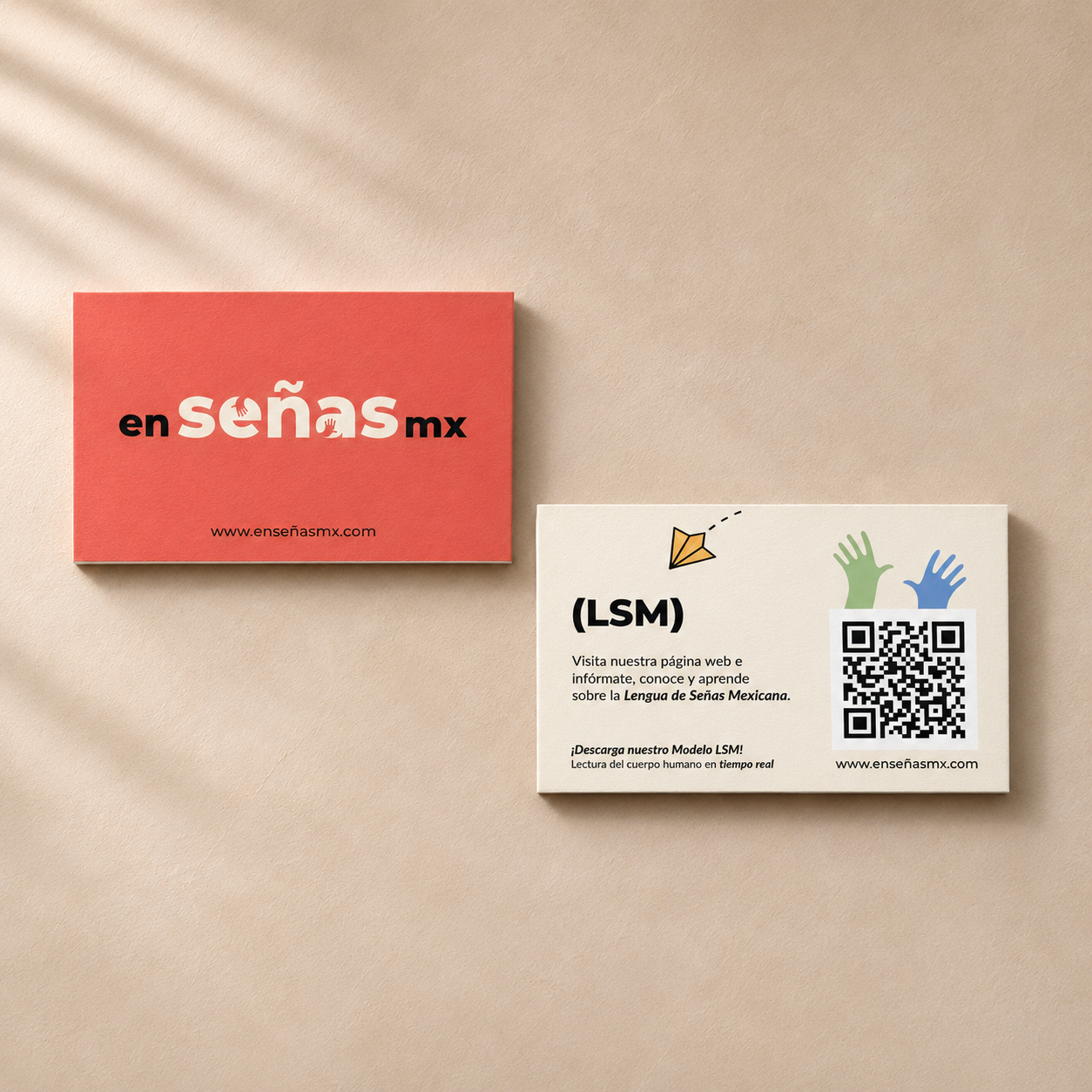
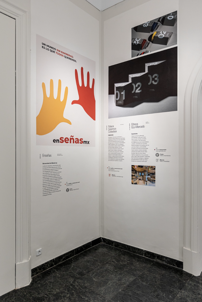
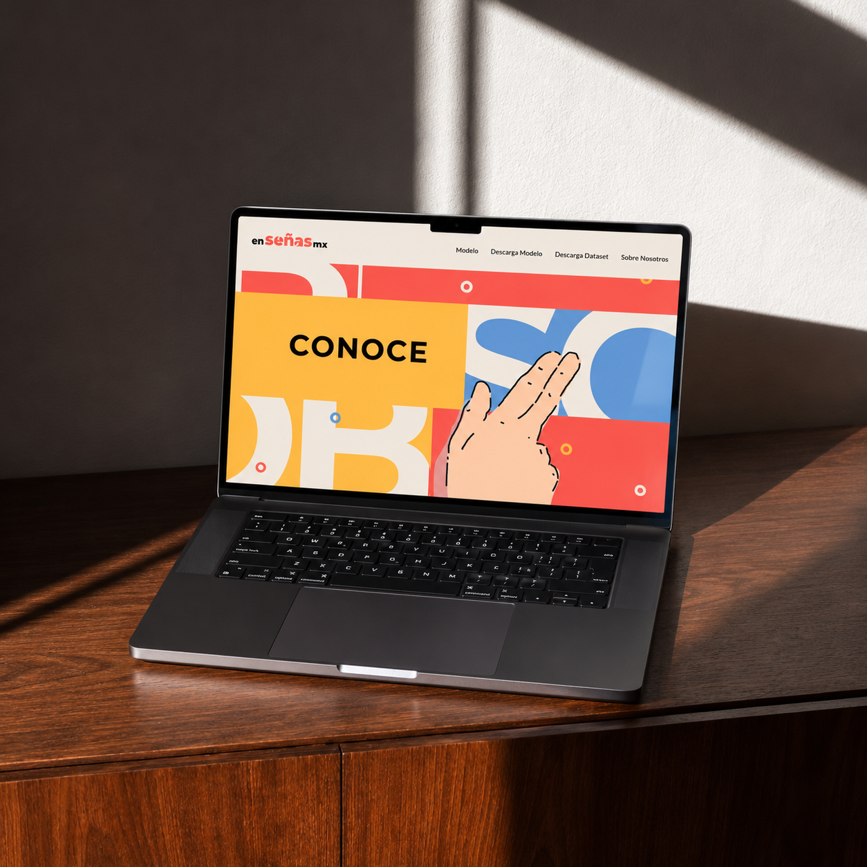
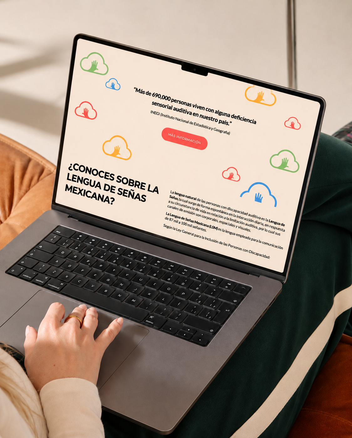
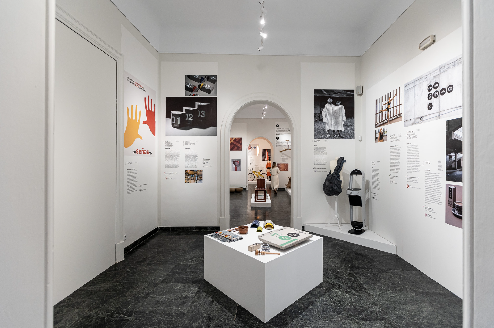
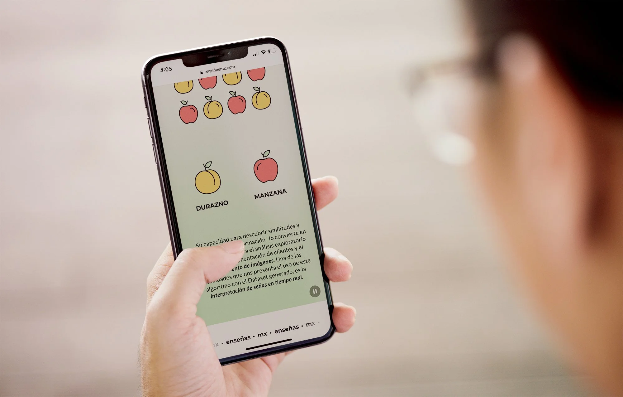
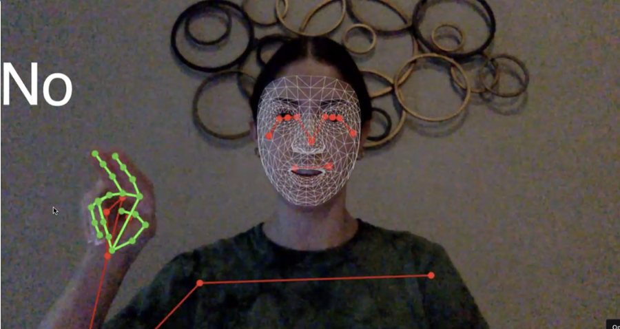
EnseñasMX is a thesis project that brings together branding and the design of a machine learning model capable of interpreting Mexican Sign Language (LSM) in real time. The project explores how design and technology can help reduce communication barriers between Deaf people who use LSM and people who do not.
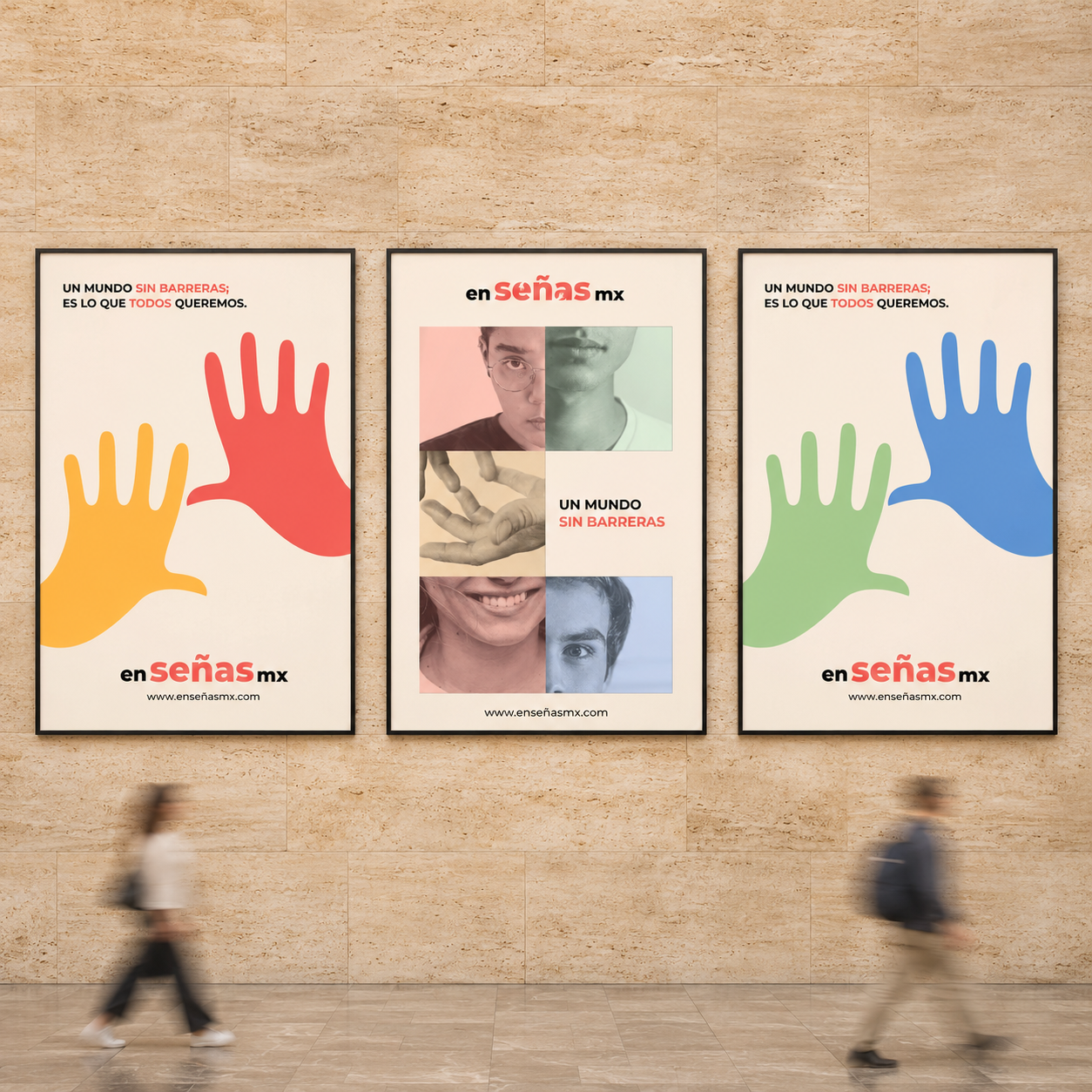
PURPOSE & APPROACHThe goal was to make everyday communication more accessible and support greater independence and inclusion. The project approached accessibility as a foundation for both the tool and its identity, connecting a technical concept with a clear, approachable brand.
DESIGN APPROACHThe branding gives EnseñasMX a recognizable identity and communicates its purpose to a broader audience. The visual work brings the project’s inclusive mission into its presentation, showing how graphic design can help people understand and connect with a technology developed around a real communication need.
RECOGNITIONEnseñasMX received two international design awards:
A’ Design Award, in the Social Design category.
Design for All People Award, at the 8th Ibero-American Design Biennial (BID22), organized by DIMAD. The project was also included in the official exhibition, catalog, and digital gallery.